ImpactStory awarded $500k grant from the Sloan Foundation

Supported by the Alfred P. Sloan Foundation

We’re delighted to announce that ImpactStory has been awarded a $500k grant from the Alfred P. Sloan Foundation.

Over the next two years, the funds will “support the scaling and further development to sustainability of ImpactStory, a nonprofit open altmetrics platform that helps scholars evaluate, sort, consume, and reward web-native products.”

This grant continues the relationship between ImpactStory and Sloan.   ImpactStory was still an evening-and-weekends project running hackathon code when it was awarded $125k from the Sloan Foundation in 2012.  This initial funding allowed us to incorporate as a stand-alone nonprofit company, develop a scalable open web application (with context, embeddable widgets, and impact profile pages), and do outreach for open altmetrics.

Thank you, Sloan.  Thanks especially to Program Director Josh Greenberg for his advice and encouragement, the grant reviewers for such perceptive feedback, and everyone who wrote us a letter of support.

We are so excited to have this runway!  Hold on to your hats, here we go….

new release: ImpactStory Profiles

Your scholarship makes an impact. But if you’re like most of us, that impact isn’t showing up on your publication list. We think that’s broken. Why can’t your online publication list share the full story of your impact?

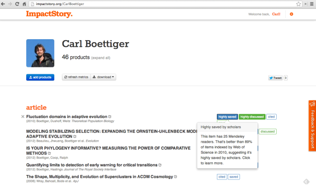
Today we announce the beginning of a solution: ImpactStory Profiles.  Researchers can create and share their impact profiles online under a custom URL, creating an altmetrics-powered CV.  For example, http://impactstory.org/CarlBoettiger leads to the impact profile page below:

http://impactstory.org/CarlBoettiger

 http://impactstory.org/CarlBoettiger

We’re still in the early stages of our ImpactStory Profile plans, and we’re excited about what’s coming.  Now’s a great time to claim your URL —  head over and make an impact profile.

And as always, we’d love to hear your feedback: tell us what you think (tweet us at @impactstory or write through the support forum), and spread the word.

Also in this release:

  • improved import through ORCID
  • improved login system
  • lovely new look and feel!

Thanks, and stay tuned… lots of exciting profile features in store in the coming months!

Uncovering the impact of software

Academics — and others — increasingly write software.  And we increasingly host it on GitHub.  How can we uncover the impact our software has made, learn from it, and communicate this to people who evaluate our work?

Screen Shot 2013-01-18 at 5.56.20 AM

GitHub itself gets us off to a great start.  GitHub users can “star” repositories they like, and GitHub displays how many people have forked a given software project — started a new project based on the code.  Both are valuable metrics of interest, and great places to start qualitatively exploring who is interested in the project and what they’ve used it for.

What about impact beyond GitHub?  GitHub repositories are discussed on Twitter and Facebook.  For example, the GitHub link to the popular jquery library has been tweeted 556 times and liked on Facebook 24 times (and received 18k stars and almost 3k forks).

Is that a lot?  Yes!  It is one of the runaway successes on GitHub.

How much attention does an average GitHub project receive? We want to know, to give reference points for the impact numbers we report.  Archive.org to the rescue! Archive.org posted a list of all GitHub repositories active in December 2012.  We just wanted a random sample of these, so we wrote some quick code to pull random repos from this list, grouped by year the repo was created on GitHub.

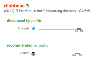
Here is our reference set of 100 random GitHub repositories created in 2011.  Based on this, we’ve calculated that receiving 3 stars puts you in the top 20% of all GitHub repos created in 2011, and 7 stars puts you in the top 10%.  Only a few of the 100 repositories were tweeted, so getting a tweet puts you in the top 15% of repositories.

You can see this reference set in action on this example, rfishbase, a GitHub repository by rOpenSci that provides an R interface to the fishbase.org database:

Screen Shot 2013-01-18 at 5.31.49 AM

So at this point we’ve got recognition within GitHub and social media mentions, but what about contribution to the academic literature?  Have other people used the software in research?

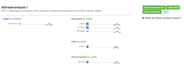
Software use has been frustratingly hard to track for academic software developers, because there are poor standards and norms for citing software as a standalone product in reference lists, and citation databases rarely index these citations even when they exist.  Luckily, publishers and others are beginning to build interfaces that let us query for URLs mentioned within full text of research papers… all of a sudden, we can discover attribution links to software packages that are hidden in not only in reference lists, but also methods sections and acknowledgements!  For example, the GitHub url for a crowdsourced repo on an E Coli outbreak has been mentioned in the full text of two PLOS papers, as discovered on ImpactStory:

Screen Shot 2013-01-18 at 4.45.11 AM

There is still a lot of work for us all to do.  How can we tell the difference between 10  labmates starring a software repo and 10 unknown admirers?  How can we pull in second-order impact, to understand how important the software has been to the research paper, and how impactful the research paper was?

Early days, but we are on the way.  Type in your github username and see what we find!

Nature Comment: Altmetrics for Alt-Products

One of our goals at ImpactStory is widespread respect for all kinds of research products.  We therefore celebrate the upcoming NSF Policy change to BioSketch requirements, instructing investigators to list their notable Products rather than their Publications in all grant proposals.  Yay!

This policy change, and the resulting need to gather altmetrics across scholarship, is discussed in a Comment just published in Nature, authored by yours truly:

    Piwowar H. (2013). Value all research products., Nature, DOI:

The article is will be behind a paywall but is free for a few days, so run over and read it quickly!  🙂

I’ve also written up a few supplementary blog posts to the Comment, on my personal blog:

  • the first draft of the article (quite different, and with some useful details that didn’t make it into the final version)
  • behind-the-scenes look at the editorial and copyright process

And here for convenience is the ImpactStory exemplar mentioned in the article:  a data set on an outbreak of Escherichia coli has received 43 ‘stars’ in the GitHub software repository, 18 tweets and two mentions in peer-reviewed articles (see http://impactstory.org/item/url/https://github.com/ehec-outbreak-crowdsourced/BGI-data-analysis).

ImpactStory from your ORCID ID!

Did you hear?  ORCID is now live!

ORCID is an international, interdisciplinary, open, nonprofit initiative to address author name disambiguation.  Anyone can register for an ORCID ID, then associate their publications with their record using CrossRef and Scopus importers.  This community system of researcher IDs promises to streamline funding and scholarly communication.

ImpactStory is an enthusiastic ORCID Launch Partner.  Once your publications are associated with an ORCID record, it is very easy to pull them into an ImpactStory report:

A few details:

  • ImpactStory only imports public publications. If your Works are currently listed in your ORCID profile as “limited” or “private”, you can change them to “public” on your ORCID Works update page.
  • We currently only import Works with dois — stay tuned, we’ll support more work types soon!

Sound good?  Go register for an ORCID ID now and give it a spin!

Introducing ImpactStory

ImpactStory has launched!  We’ve refocused and renamed Total-Impact: this first release of ImpactStory is a quantum step forward, debuting badges, normalization, and categorization.

To try out ImpactStory, start by visiting http://impactstory.org and point to the scholarly products you’ve made.  Articles can be easily imported from Google Scholar Profiles, DOIs, and PubMed IDs.  We also have importers for software on GitHub, presentations on SlideShare, and datasets on Dryad (and we’ve got more importers on the way).

ImpactStory searches over a dozen Web APIs to learn where your stuff is making an impact. Instead of a Wall Of Numbers, we categorize your impacts along two dimensions: audience (scholars or the public) and type of engagement with research (view, discuss, save, cite, and recommend).

As you drill into the details of an item in your report, you can see a graph of the percentile score for each metric compared to a baseline.  In the case of articles, the baseline is “articles indexed in Web of Science that year.” If your 2009 paper has 17 Mendeley readers, for example, that puts you in the 87th-98th percentile of all WoS-indexed articles published in 2009 (we report percentiles as a range expressing the 95% confidence interval). Since it’s above the 75th percentile, the article is also tagged with a “highly saved by scholars” badge. Scanning the badges helps you get a sense of your collection’s overall strengths, while also letting  you easily spot success stories.

Interested?  Have a look at this sample collection, or even better, go create your own report!

We’re excited for folks to try out ImpactStory, and excited to get feedback; it’s a beta release, and want to listen to the community as we prioritize new features. Working together, we can build something that helps reseachers tell data driven stories that push us beyond the Impact Factor and beyond the article.

For more information:

A new framework for altmetrics

At total-impact, we love data. So we get a lot of it, and we show a lot of it, like this:


There’s plenty of data here. But we’re missing another thing we love: stories supported by data. The Wall Of Numbers approach tells much, but reveals little.

One way to fix this is to Use Math to condense all of this information into just one, easy-to-understand number. Although this approach has been popular, we think it’s a huge mistake. We are not in the business of assigning relative values to different metrics; the whole point of altmetrics is that depending on the story you’re interested in, they’re all valuable.

So we (and from what they tell us, our users) just want to make those stories more obvious—to connect the metrics with the story they tell. To do that,  we suggest categorizing metrics along two axis: engagement type and audience. This gives us a handy little table:

Now we can make way more sense of the metrics we’re seeing. “I’m being discussed by the public” means a lot more than “I seem to have many blogs, some twitter, and ton of Facebook likes.” We can still show all the data (yay!) in each cell—but we can also present context that gives it meaning.

Of course, that context is always going to involve an element of subjectivity. I’m sure some people will disagree about elements of this table. We categorized tweets as public, but some tweets are certainly from scholars. Sometimes scholars download html, and sometimes the public downloads PDFs.

Those are good points, and there are plenty more. We’re excited to hear them, and we’re excited to modify this based on user feedback. But we’re also excited about the power of this framework to help people understand and engage with metrics. We think it’ll be essential as we grow altmetrics from a source of numbers into a source of data-supported stories that inform real decisions.

Choosing reference sets: good compared to what?

In the previous post we assumed we had a list of 100 papers to use as baseline for our percentile calculations. But what papers should be on this list? 

It matters: not to brag, but I’m probably a 90th-percentile chess player compared to a reference set of 3rd-graders. The news isn’t so good when I’m compared to a reference set of Grandmasters. This is a really important point about percentiles: they’re sensitive to the reference set we pick.

The best reference set to pick depends on the situation, and the story we’re trying to tell. Because of this, in the future we’d like to make the choice for total-impact reference sets very flexible, allowing users to define custom reference sets based on query terms, doi lists, and so on.

For now, though, we’ll start simply, with just a few standard reference sets to get going.  Standard reference sets should be:

  • meaningful
  • easily interpreted
  • not too high impact nor too low impact, so gradations in impact are apparent
  • applicable to a wide variety of papers
  • amenable to large-scale collection
  • available as a random sample if large

For practical reasons we focus first on the last three points.  Total-impact needs to collect reference samples through automated queries.  This will be easy for the diverse products we track: for Dryad datasets we’ll use other Dryad datasets, for GitHub code repositories we’ll use other GitHub repos.  But what about for articles?  

Unfortunately, few open scholarly indexes allow queries by scholarly discipline or keywords… with one stellar exception.  PubMed.  If only all of research had a PubMed!  PubMed’s eUtils API lets us query by MeSH indexing term, journal title, funder name, all sorts of things.  It returns a list of PMIDs that match our queries.  The api doesn’t return a random sample, but we can fix that (code).  We’ll build ourselves a random reference set for each publishing year, so a paper published in 2007 would be compared to other papers published in 2007.

What specific PubMed query should we use to derive our article reference set?  After thinking hard about the first three points above and doing some experimentation, we’ve got a few top choices:

  • any article in PubMed
  • articles resulting from NIH-funded research, or
  • articles published in Nature,

All of these are broad, so they are roughly applicable to a wide variety of papers.  Even more importantly, people have a good sense for what they represent — knowing that a metric is in the Xth percentile of NIH-funded research (or Nature, or PubMed) is a meaningful statistic.  

There is of course one huge downside to PubMed-inspired reference sets: they focus on a single domain.  Biomedicine is a huge and important domain, so that’s good, but leaving out other domains is unhappy.  We’ll definitely be keeping an eye on other solutions to derive easy reference sets (a PubMed for all of Science?  An open social science API?  Or hopefully Mendeley will include query by subdiscipline in its api soon?).  

Similarly, Nature examines only on a single publisher—and one that’s hardly representative of all publishing. As such, it may feel a bit arbitrary.

Right now, we’re leaning toward using NIH-funded papers as our default reference set, but we’d love to hear your feedback. What do you think is the most meaningful baseline for altmetrics percentile calculations?

(This is part 5 of a series on how total-impact will give context to the altmetrics we report.)

Percentiles, a test-drive

Let’s take the definitions from our last post for a test drive on tweeted percentiles for a hypothetical set of 100 papers, presented here in order of increasing readership with our assigned percentile ranges:

  • 10 papers have 0 tweets (0-9th percentile)
  • 40 papers have 1 tweet (10-49th)
  • 10 papers have 2 tweets (50-59th)
  • 20 papers have 5 tweets (60-79th)
  • 1 paper has 9 tweets: (80th)
  • 18 papers have 10 tweets (81-98th)
  • 1 paper has 42 tweets (99th)

If someone came to us with a new paper that had 0 tweets, given the sample described above we would assign it to the 0-9th percentile (using a range rather than a single number because we roll like that).  A new paper with 1 tweet would be in the 10th-49th percentile.  A new paper with 9 tweets is easy: 80th percentile.

If we got a paper with 4 tweets we’d see it’s between the datapoints in our reference sample — the 59th and 60th percentiles — so we’d round down and report it as 59th percentile.  If someone arrives with a paper that has more tweets than anything in our collected reference sample we’d give it a 100th percentile.

Does this map to what you’d expect?  Our goal is to communicate accurate data as simply and intuitively as possible.  Let us know what you think!  @totalimpactorg on twitter, or team@total-impact.org.

(part 4 of a series on how total-impact plans to give context to the altmetrics it reports. see part 1part 2, and part 3.)

Percentiles, the tricky bits

Normalizing altmetrics seem by percentiles seems so easy!  And it is. except when it’s not.

Our first clue that percentiles have tricky bits is that there is no standard definition for what percentile means.  When you get an 800/800 on your SAT test, the testing board announces you are in the 98th percentile (or whatever) because 2% of test-takers got an 800… their definition of percentile is the percentage of tests with scores less than yours.  A different choice would be to declare that 800/800 is the 100th percentile, representing the percentage with tests with scores less than or equal to yours.  Total-impact will use the first definition: when we say something is in the 50th percentile, we mean that 50% of reference items had strictly lower scores.

Another problem: how should we represent ties?  Imagine there were only ten SAT takers: one person got 400, eight got 600s, and one person scored 700.  What is the percentile for the eight people who scored 600?  Well…it depends.

  • They are right in the middle of the pack so by some definitions they are in the 50th percentile.
  • An optimist might argue they’re in the 90th percentile, since only 10% of test-takers did better.
  • And by our strict definition they’d be in the 10th percentile, since they only beat the bottom 10% outright.

The problem is that none of these are really wrong; they just don’t include enough information to fully understand the ties situation, and they break our intuitions in some ways.

What if we included the extra information about ties? The score for a tie could instead be represented by a range, in this case the 10th-89th percentile.  Altmetrics samples have a lot of ties: many papers recieve only one tweet, for example, so representing ties accurately is important.  Total-impact will take this range approach, representing ties as percentile ranges. Here’s an example, using PubMed Central citations:

Finally, what to do with zeros?  Impact metrics have many zeros: many papers have never been tweeted.  Here, the range solution also works well.  If your paper hasn’t been tweeted, but neither have 80% of papers in your field, then your percentile range for tweets would be 0-79th.  In the case of zeros, when we need to summarize as a single number, we’ll use 0.

We’ll take these definitions for a test-drive in the next post.

(part 3 of a series on how total-impact plans to give context to the altmetrics it reports. see part 1part 2, and part 4.)