Ok I know for maximum impact we should probably spread all these blog posts out over multiple days, but I’m way too eager to share — I think people interested in Green OA will be really interested in this, I know I am.
It’s from the supplementary information section of the preprint, Section 11.1:
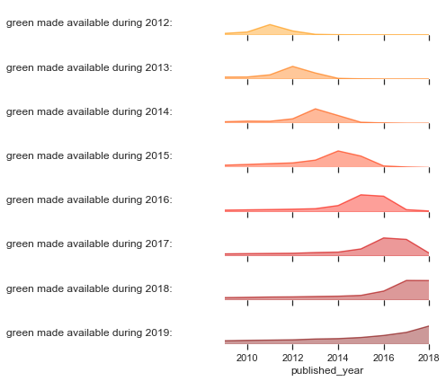
In the figure below we plot the number of Green OA papers made available each year vs their date of publication. The first plot is a histogram of number of papers made available each year (one row for each year).
The next plot is the same, but superimposes the articles made available in previous years. This stacked area represents the total cumulative number of Green OA papers that are available in that year — if you were in that year and wondering what was available as Green OA that’s what you’d find.

The third plot is a larger version of the availability as of 2018, showing the accumulation of availability. It allows us to appreciate that less than half of papers papers published in, say, 2015, were made available the same year — most of the papers have been made available in subsequent years. The fourth plot is a slice in isolation, for clarity: the Green OA for articles with a Publication Date of 2015.
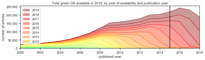

Again, this last plot is when articles that were published in 2015 were actually made available in repositories. As you can see at the bottom of the stacked bar, a very few articles that were published in 2015 were actually posted in a repository in 2014. Those are preprints. A lot of articles published in 2015 appeared in a repository in 2015, but even more had a delay and didn’t appear in a repository until 2016. A full 40% of articles had an OA lag of more than a year, including some with an OA lag of four years!
More details on data collection are in the paper — just wanted to dig this out of Supplementary Information so that fellow nerds who’d enjoy this data don’t miss it 🙂